Development Newsletters
Testing Mobile Web Templates
Mobile devices are getting more important in consuming online content as time goes by. Many of us read news while on the way to work or when waiting for someone in a bar. Publishers are tweaking their portfolio to adapt designs to small screens and if you visit a website from your mobile or tablet, there is a high chance that it will automatically redirect you to a compact version which is more easily readable on the small display.
We would like to let you start discovering the potential of displaying ads on mobile-optimized websites and therefore we invite you to test our new Mobile Web Templates. As Flash is not is supported on many mobile devices, these templates are meant to deliver Rich Media content by using the power of HTML5 and CSS3.
The novelty in Mobile Web Templates
If you are not a tech-savvy person then you might ask: ‘How are these templates different? gDE2 had HTML creative type support since the beginning, what has changed? The novelty comes in various forms:
- template structure and parameters provide a new way for mixing HTML, CSS and JavaScript
- optional re-scaling of ads to fill in available space and adapt to orientation change
- click-to-call support
- possibility of importing ads made in third party tool
HTML5 and CSS3 are the newest versions of long-existing technologies that let you create more sophisticated webpages and ads, without having to rely on browser plugins like Flash or Silverlight. HTML5 and CSS3 are built into your modern browsers and therefore can be more effective than any other solution, which is not integrated into the browser itself. Our templates are structured to let you easily combine the HTML, CSS and JS content of your creatives.
There are many mobile-optimized webpages which take into account the diversity of mobile device screen sizes and adapt to different screen estates dynamically (responsive design). For such content we offer the option of re-scaling ads to fit the parent container's width (a parent container of an ad is basically an element of a webpage, which incorporates the ad and thus defines its position as well) and the height of the device screen. The scaling follows two simple steps, if activated:
- check the width of the ad's parent element in the web page and the original (design) dimensions of the ad then calculate the scale ratio needed to enlarge or shrink the ad for fitting in;
- check the height of the device screen and if the ad is still higher then scale it one more time to make it fit in vertically too.
The second step ensures that once a user scrolls to the part of the webpage, where the ad is displayed, it can be fully seen without further scrolling. On desktop computers it might not be an issue, but it can be a useful feature on mobile webpages which may be very small in terms of screen estate.
Concerning smartphones we shouldn't forget about a unique way of user conversion either: click-to-call ads. All of our Mobile Web Templates are equipped with a parameter to enter a click-to-call number. When such number is defined for the creative then tapping/clicking the ad will open up the dialler application of the phone with the given number, instead of opening the landing page. While click-to-call numbers are a powerful way for direct and immediate user conversion, it needs to be used carefully. There is no reliable way at the moment to find out if click-to-call numbers are supported by a given mobile device or not. Even though an iPad and iPhone both use WebKit, only the iPhone can understan the special URI scheme used for click-to-call functionality. Thus we recommend that you check the mobile device ranking for your country at gemiusRanking before launching a click-to-call campaign and ask publishers to target your ads to the most popular mobile phones while excluding tablets. In practice, it usually means targeting to iPhones and some of the more widely used Android phones. Until a standard solution arises for detecting tel: availability, this is the method of making sure that neither tablets, nor desktop browsers are targeted with click-to-call ads.
We also plan to provide support for third party HTML5 content creation tools in our Mobile Web Templates, but due to the nature of exported content of such tools, you may only import Sencha Animator ads for now (version 1.2 and up). We also keep our eyes on how some of the other third party tools evolve, like Adobe Edge. We plan to extend our importing feature in the future if significant demand arises and when these tools also start to offer more compact export formats.
Mobile Web Basic
This is one of the more simple templates, displaying an RM ad in a specific place in the page flow, for example between two paragraphs of text. Scaling makes it a good choice for responsive webpage designs. This is the most basic form of Flash/Silverlight substitutes to start experimenting with.
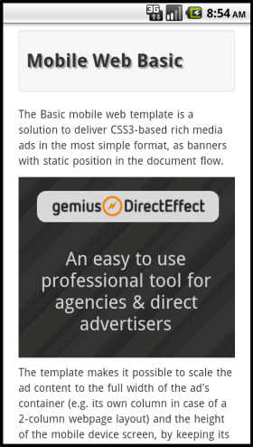
Figure: Mobile Web Basic
Mobile Web Interstitial
Compared to the Basic template, the scaling mechanism of Interstitial takes into account the full screen width and height, as the ad is displayed above the rest of the page content. A semi-transparent cover also helps users focus on the ad itself. Of course both the colour and the transparency may be adjusted when defining a creative in gDE2 interface. Once the ad is gone, it doesn't get displayed again during the same page view.
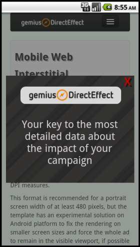
Figure: Mobile Web Interstitial
Mobile Web Full Screen
This is another template which resembles a format used exclusively in desktop browsers before, with some mobile magic added. Scaling logic depends on the state of the creative. If it's collapsed then it scales to its parent container. In expanded (full screen) state it scales simply to screen width and height (with a semi-transparent cover around the ad). The collapsed state is aimed at displaying short, catchy marketing messages, while the full screen version is able to expose more information and convert users to the landing page or the dialler with a specific telephone number set.
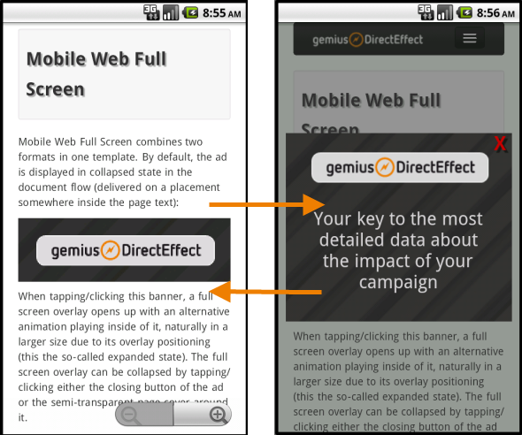
Figure: Mobile Web Full Screen
Mobile Web TextBar
This template may seem to be an odd-one-out, as it doesn't rely on complicated and fluffy animations, but purely on textual advertising message. We thought it might be interesting to have a creative which is styled with the help of CSS to look similar to (though not exactly the same as) ads in native mobile apps. This creative adapts to the screen size as well, dynamically switching between two different ad text versions: one with fewer and one with more character count (targeted to small and large screen estates respectively). After entering the short and long version of the ad text, our template code takes care about the rest: to adapt to screen width in terms of the bar size as well as the length of the displayed text. It can be positioned in the document flow (i.e. appearing in the web page content where its placement code is) or displayed as a sticky (fixed) bar at the top or bottom. As this creative consists of purely textual data in case of in-page position and the only image is a closing button for sticky positions (for which you are also able to upload your own version), it is consequently smaller in size and should be delivered faster than image-heavy creatives. We provide a reasonable amount of options for customization via parameters to control the colour of the ad text, the border and the background colour. In case of background colour there are actually two parameters, letting you create a gradient effect if the colour values differ.
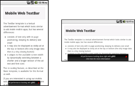
Figure: Mobile Web TextBar
Are we there yet?
We consider these templates to be work-in-progress. The main reason is that the mobile browser landscape is still quite fragmented in terms of supporting standards. And it's not only about HTML5 and CSS3 specifications; it's about such (theoretically) simple issues like reporting the mobile browser's visual viewport width and height. We aim to provide you universally working solutions even in challenging cases like retrieving available screen dimensions to re-scale or re-position our ads. When visible, the address bar height is taken into account by some browsers and omitted by others. We also also aiming to display sticky TextBar creatives even if the browser doesn't have adequate (or any) support for fixed positions. Quirksmode has an excellent summary of such problems for the technically-inclined.
There are also issues rooted simply in the early state of HTML5/CSS3 implementation and tools. For example, Sencha Animator doesn't support yet the latest versions of Opera (and consequently, Opera Mobile) or IE, even though these browsers also have a certain degree of HTML5/CSS3 functionality. We assume that Sencha will work out eventually how to embrace more browsers, but until it happens, we decided to beef up our templates with alternative image support, in case you prefer to expose Opera Mobile users as well to your campaign. Please note that there are various ways of creating HTML/CSS3 ads and your custom creations may be rendered without any issues in Opera, too. To sum up: alternative images are only necessary for the affected browsers and only in case of Sencha Animator content.
One last thing we experimented with in the current version of these templates is switching the target DPI setting of the browser viewport, if the ad was designed for a wider size than a particular mobile web page. In other words, if an ad is originally wider than the web page then we instruct the mobile browser to squeeze more content in the screen horizontally, thus achieving a zoom out effect. While it results in a loss of initial detail on mobiles with smaller screens (e.g. squeezing two pixels into one), it also makes sure that the ad fits the screen width completely. As soon as the ad is closed or collapsed we also switch back the original viewport settings of the web page, in case such settings were present. But this is really just a remark for the tech-focused minds so that they know why it is happening, should they bump into a scenario like this. We will decide about the usage of such tweak based on feedback from you and publishers.
The showcase
We have prepared a showcase of the new templates for you at the following URL:
http://www.gemius.com/gde2_mobileads

Please visit the showcase with your mobile device (smartphone or tablet) and check out how the ads work. As it was mentioned before, the fragmentation of mobile browser capabilities is still somewhat high, please be prepared that your experience may vary from device to device, or even between various browsers on the same phone. However, the more devices our clients use to test these templates, the bigger help it means for us to try and make them work even better. Any feedback is appreciated and welcome at rd@adocean-global.com email address. If you send feedback, please always add some information about the used mobile phone or tablet model and the browser itself (for example native WebKit or Firefox Mobile, including version numbers). You may also want to test these templates in your gDE2 account, please contact your local Technical Support in that case and our colleagues will give you access to the new templates and their technical specification.
Testing is free and much appreciated, the pricing of Mobile Web Templates will be announced at a later date.
Known issues (browser limitations):
- We have experienced scaling problems with the native browsers of Android 2.2 and 2.3 devices (related to a documented Android bug, which has been seemingly fixed in version 3.0 and up).
- Some Android 2.3 WebKit versions act unpredictably when reporting the inner height of the browser viewport, leading to problems with sticky bottom TextBars. We have left this ad example in our showcase intentionally, so that you're also able to see exactly he problem. However, in WebKit versions that support position: fixed already in CSS this problem is not relevant. If bottom position is not a must than we recommend using sticky top position instead or in-page positioning as last resort.